For the past few years, it’s become pretty darn obvio us that the trend online has been lead towards visually-oriented media.
The biggest social media networks like Facebook, Instagram and Pinterest all are visually appealing sites, this proves that good images = great websites!
Not only have these changes driven social networks, but it’s become critical for driving online sales: and the real estate market is no exception.
If you were attempting to sell or rent your home online with shoddy pictures (or none at all), then you’ve placed yourself at a total disadvantage. Especially when you most likely have all the pro photography tools you need, stashed right in your purse or pocket.
Since you most likely have a smartphone, then you’re already 95% of the way to capturing some professional-looking, gorgeous shots …that sell.
But first, let’s get the MOST important factor out of the way.
IMAGE QUALITY IS KEY
 The absolute most critical aspect in any photo for a home-selling profile page (or really anything online) is that of image quality. Quite frankly, if the photos posted aren’t sharp, then you might as well leave the visuals to the viewer’s imagination. Valorie L. Floyd of Keller Williams Realty wrote a post, which was featured on inman.com, where she discusses the perfect amount of megapixels necessary for a photo to do you any good:
“I would recommend no less than a 5-megapixel camera to get some clear and acceptable pictures. As you know, these types of cameras are very inexpensive today and can be purchased at any electronics retailer for a very low cost.”
At 5 megapixels, she’s not kidding about the price factor. It’s 2015, meaning that any camera with 5MPs is going to be cheap -super cheap. For instance, Digital Trends published an article listing ten awesomely cheap smartphones -and none of which had any less than a 5MP camera (including the Motorola Moto G for $40 at Verizon).
That’s why taking great shots of your home’s online selling potential is well within your reach. Now, here’s how you get it done, using the same tricks that the pros use.
#5: SHOOT WHAT YOU’D WANT TO SEE IF YOU WERE BUYING A HOME
Let’s take a second to stop and consider something of HUGE importance when it comes to shooting photos of your home: what would your buyers want to see in each shot? Now, here’s an even better way to look at this…
If you were in search of a home like yours, what would you want to see in the photos that were posted by the seller?
Curb appeal is essential when it comes to selling your home, mainly because people love pretty things! Your back deck, patio, or front porch add character to your home and can really add a sense of excitement, bringing your home to life. You’d also want to provide a look inside the most important rooms, such as the kitchen, living room, master bedroom, and master bathroom.
As for what might constitute a wasted picture, you could probably state that there’s a shed in the backyard, an unfinished basement, and lots of space in the garage -since these aren’t usually the most aesthetically pleasing aspects of a home’s property.
If there were a photo limit, it would be best to save your shots on the more important parts of the property.
Put it this way; QUALITY OVER QUANTITY ALWAYS WINS!
#4: THINK IN 3D/USING ANGLES FOR THE WIN
 As we’ve mentioned, you want the property to come to life in the eyes of the person who is viewing your home’s page, and nothing will suck the life out of a shot like photos taken head-on. The issue is that this will display more of a 2D rendering, and since photos should offer a sense of visual appeal, you’re going to want to change up your angles.
Say, for instance, you’re taking a few photos of the kitchen. The best way to bring the room to life within an image is to shoot from the corner of the room.
While a head-on, the right-angle shot might be great for analytical/measurement purposes, selling is more about gaining attraction and appeal through creativity.
Taking your photos from the corner of a room will provide attraction by allowing a variety of angles to be seen by the viewer -and that will bring a 2D picture into 3D reality.
#3: ACCOUNT FOR WHERE YOUR PHOTOS WILL BE DISPLAYED
This is more of a formatting issue than anything since having strong aesthetics should be a prevalent attribute of all your photos, regardless of where they’ll be popping up online.
The key here is to take a mental note of the required dimensions, sizes, and shapes of the image (landscape, square, portrait, etc.) in order to display them properly on the site.
Research shows that the following requirements make the perfect photo-snapping guidelines:
- Size Max: 250 Ko
- Dimensions: 5×7 = Max 1500 x 2100 pixels
- Shapes: Landscape
With this information, you’ll be able to know how you should hold the camera, how close you’d need to be for a good shot, and also how to format the photos between your smartphone’s gallery and upload them to the seller page.
#2: LOW SUNLIGHT IS YOUR FRIEND
Perhaps the best of all sellers in basically any winning money shot comes down to lighting quality. If the photo is washed out from a camera flash, too dark from compensating with afternoon sunlight, or the room was lit at night via a floor lamp -then the image won’t provide an aesthetically pleasing view into the home. You wouldn’t post a selfie if it had bad lighting so. Therefore, you shouldn’t post a home shot with it, either!
Rule of thumb, you’ll want there to be as much natural light as possible to pour in to get that million-dollar shot. If you wait a little bit after sunrise, you’ll get that perfect lighting you’ve been looking for! The reason why this timeframe works amazingly well is that the sun outside isn’t blindingly bright, which would force the smartphone’s camera to adjust accordingly. When this happens, the effect tends to be super dark rooms or windows with an intrusive glare.
Around sunset, however, you get a sense of warmth, softness, and a vibrant image that only natural light can provide.
#1: CLUTTER IS NOT YOUR FRIEND
Even if the photo itself might not have the best lighting or angles, the biggest sale killer in any photo is what objects are in it.
Similarly to #5, think about what you’d want to see -and also- what you would NOT want to see. This is one reason why Greg White of Seattle Home Photography wrote,
“This is THE #1 MOST IMPORTANT THING for showing off your listing: Get all knickknacks, stacks of paper, remote controls, extraneous furniture, family photos, pet stuff & toys out of sight. NOT under your bed. I can often see under beds when I photograph bedrooms, and it’s not a pretty sight when there’s a yard sale stuffed underneath.”
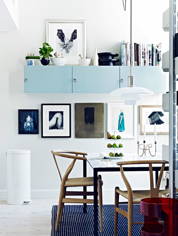
This is why it’s absolutely critical that in any photo you take, you clear the clutter first. Essentially, you want the photo to contain a few artistic touches -but you don’t want the photo to indicate that the house is still a person’s home.
While this might be the case, an image should provide the buyer with a dream of how they’d like to see it (and not necessarily how it is).
WATCH A HOME DESIGN SHOW. MIMIC ACCORDINGLY
Showing your personal items, car keys, unopened mail, laundry, etc., makes a buyer feel like they’re moving into somebody else’s house, rather than moving on their own. Remember the rules that we mentioned in our 10 commandments;
DECLUTTER, DECLUTTER, DECLUTTER
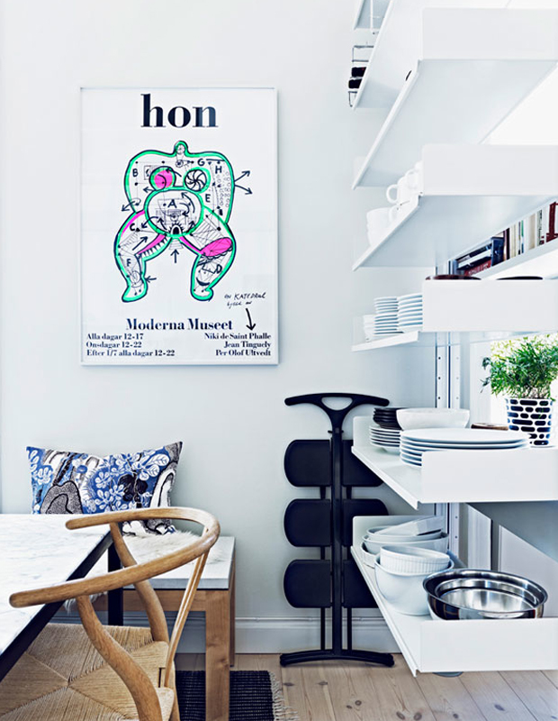
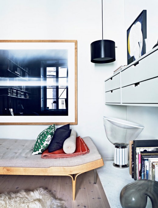
This is why a properly staged home will have artwork, books, and perhaps a magazine or two on the coffee table -but other than that- it’s free of any signs that the previous owner lived in the home.
If you’ve ever watched a home design show, their shots display exactly the kind of images that you should post. These photos should look clean, new, trendy, stylish, and of course, absent of strollers, clutter-causing-trinkets, and other yard sale items.
You can also browse through other professional shots online or in a magazine so that you can try mimicking their lighting and angles.
Follow these hacks, and you’ll be way ahead of the game over most other online home sellers.
IS PHOTOGRAPHY NOT YOUR STRONG SUIT?
No problem; we all have our individual talents! However, we can’t help but still remind you that it’s still imperative to have great photos. With that being said, if photography isn’t your strong suit, make sure to hire a photographer, which you can easily find on our website beycome!
Killer photos = killer prospects!
Source pictures from Jonas Ingerstedt’s portfolio www.ingerstedt.se


Comments are closed.